The wall behind a TV can absorb light or throw it back, use paint or real marble, and take a quick afternoon or a full weekend.
What settles the choice is whether the screen sits in a busy room that needs quieting, or against a blank wall that needs turning into something.
[link-whisper-related-posts]1. Darker Colors on Wall Behind TV
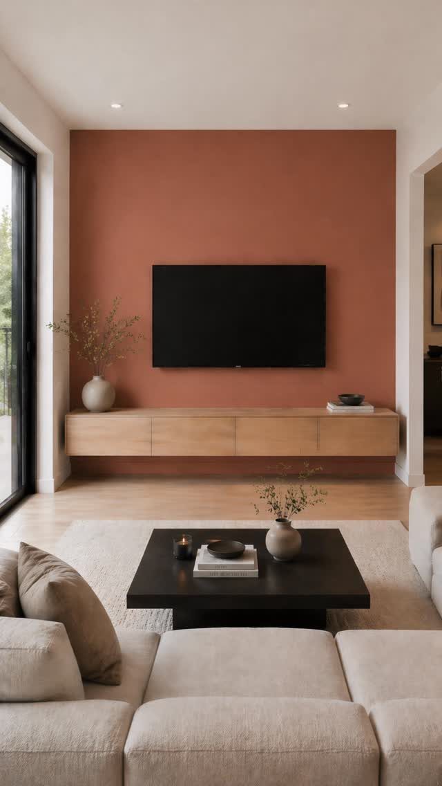
Terracotta reads warm on camera but still cuts the glare that a white wall throws back at the screen.
I learned this the hard way with a pale gray that looked fine by day and turned into a mirror once the lamps came on.
Darker colors, slate gray or deep blue, pull the same trick: the TV seems to float against them instead of fighting its own reflection.
The trade is that the wall becomes a deliberate accent, so the rest of the room needs to stay lighter to keep from feeling boxed in.
A matte finish matters more than the exact shade; eggshell or flat, never semi-gloss behind a screen.
2. Wallpapering Wall Behind TV
Painter’s tape and a large ruler are the whole job, really. Mark the TV’s center point in pencil, then the rectangle the set will occupy, and tape the border clean.
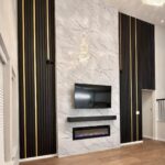
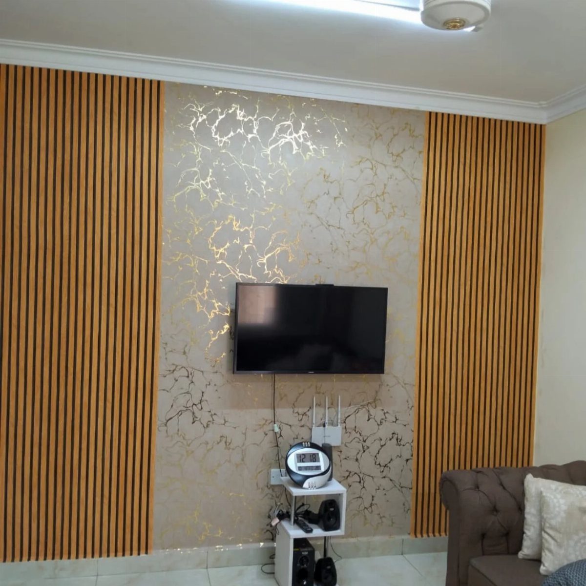
Seal the edges with your base wall color first; when that dries, roll the wallpaper or paint inside the line. Marble and gold veins read expensive, but peel-and-stick wallpaper comes down clean when you tire of it.
Flanking the paper with vertical slats, like wood panels, breaks the pattern so it does not overwhelm a small room.
I would skip this in a space where the TV already sits in a busy gallery wall; the wallpaper wants to be the single statement.
3. Built-In Bookshelves Around the TV
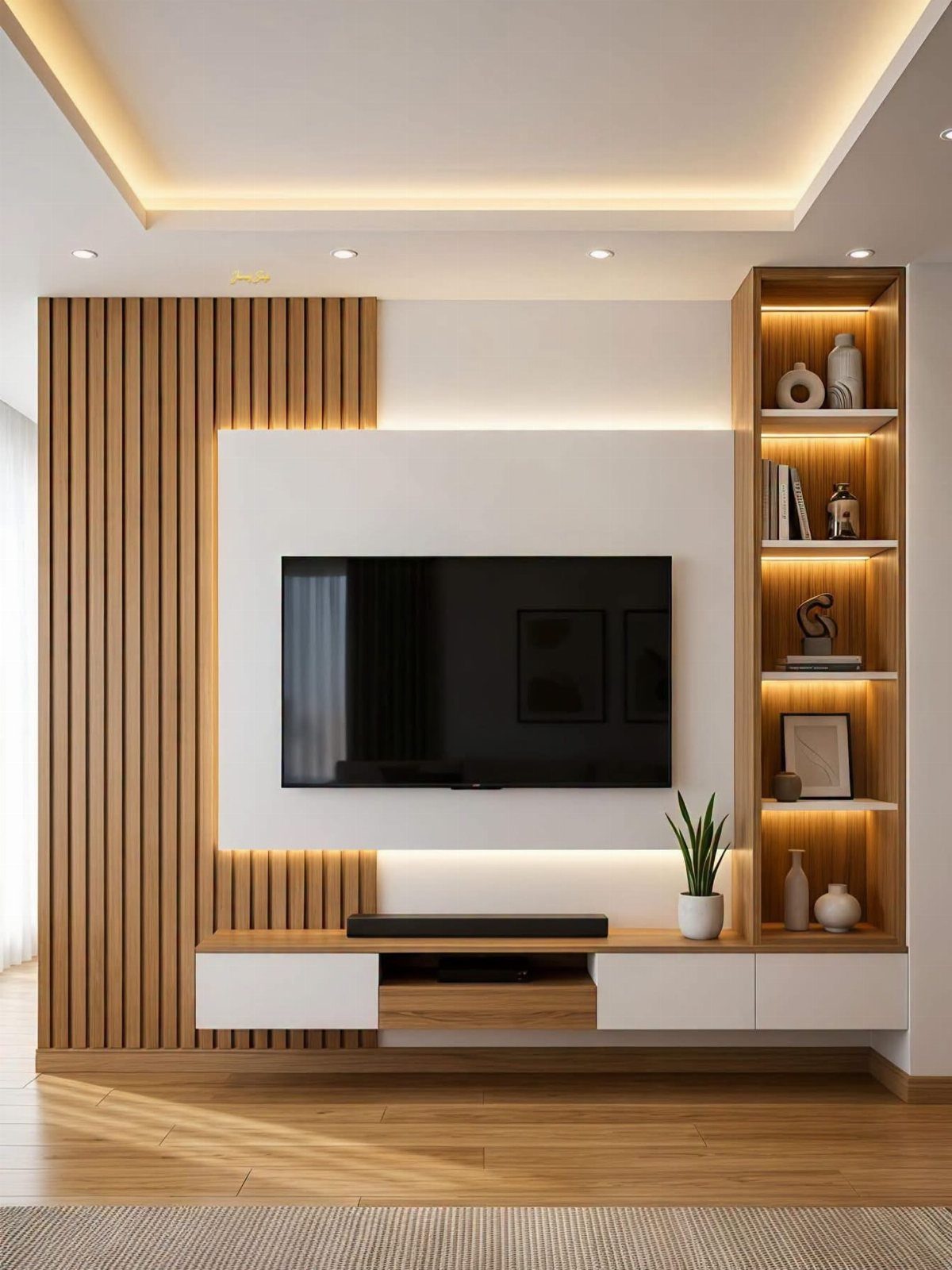
The asymmetrical version pairs slats on one side with a tall lit bookshelf on the other. That imbalance works when the room has a door or window that already breaks any chance of symmetry.
If your wall is uninterrupted, matching towers on both sides look built-in and custom without the custom price; IKEA’s Billy system, faced with trim to hide the seams, gets you most of the way there.
The shelves do not need to carry books alone. Baskets for remotes and cables, a small plant, a single ceramic piece: the eye reads the collection, not the TV.
Check your stud spacing before you commit. Leave extra width for the TV opening; nothing is worse than cutting into fresh built-ins because the mount hits empty drywall.
4. LED Strips Behind the TV
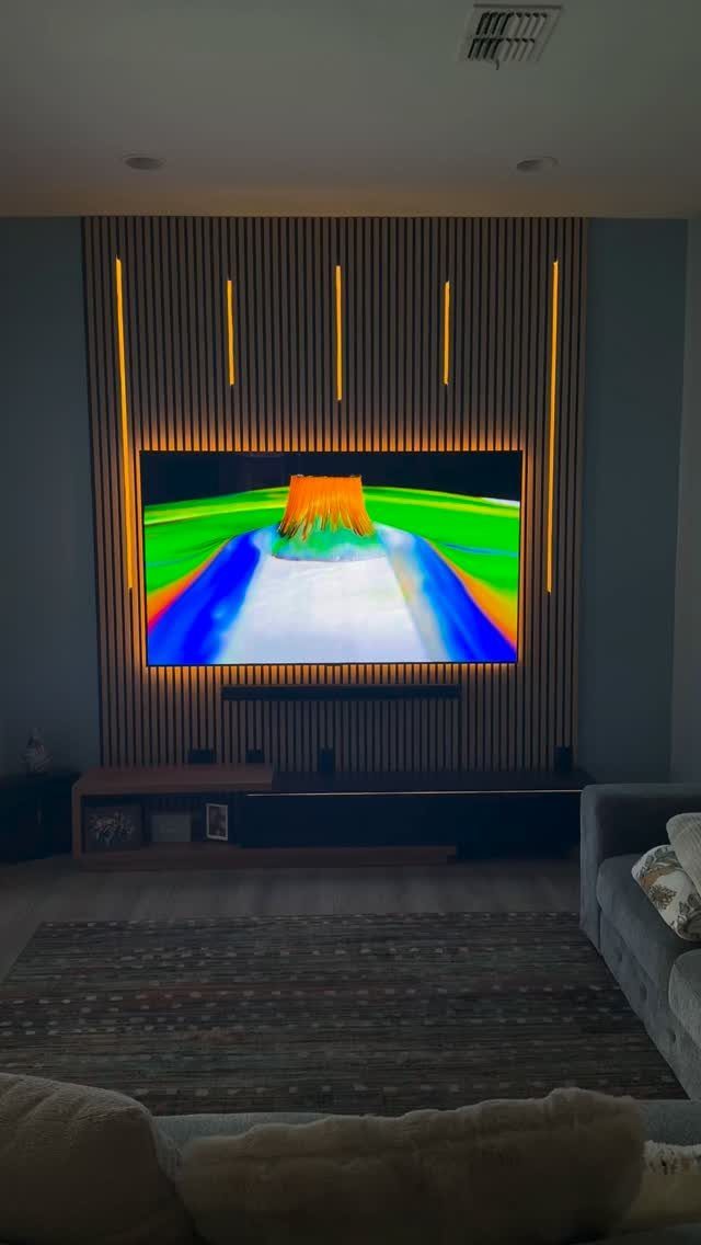
A cheap LED strip behind the TV, set to warm yellow, turns the wall into a lantern instead of a black rectangle.
Running the strip along the top edge works, but I have had better luck running three sides, top and both verticals, so the glow wraps the screen.
Most kits come with a remote for color and intensity; I leave mine on amber for movies, punch it to white when I am cleaning and need to see the dust. The effect only shows in dim light.
Daytime viewing with blinds open, the strip disappears and the wall goes flat again. Install it last, after everything else is settled, because the adhesive backing does not survive repositioning.
5. Wall Color That Matches the TV Frame
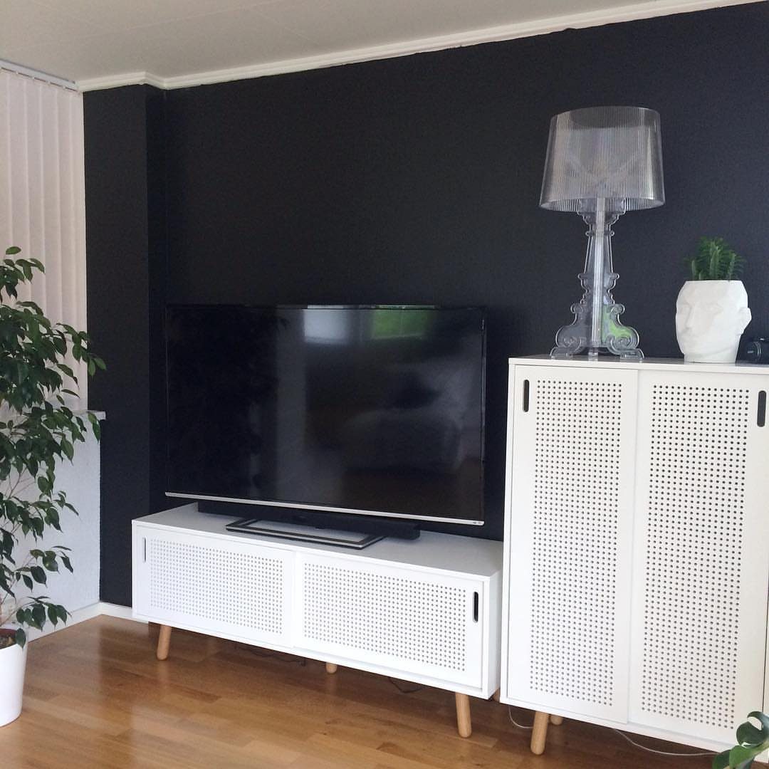
Black on black erases the bezel entirely. A TV that matches its wall sits on its console like a pane of glass propped against the wall, not a hulking appliance.
This works best with sets that have thin, uniform frames; older models with silver chins or logo badges still read as objects.
The paint needs to match the frame’s exact tone, not just its depth: a matte black frame against satin black paint catches light differently and the seam shows.
Test a swatch at the store if you can, or order a peel sample and hold it to the set in your actual room light.
I would not do this with a white-framed TV unless the whole room is already headed toward Scandinavian severity. A plant and clear lamp keep the black from feeling like a void; plan for at least one warm element nearby.
6. Vertical Wood Slat Wall
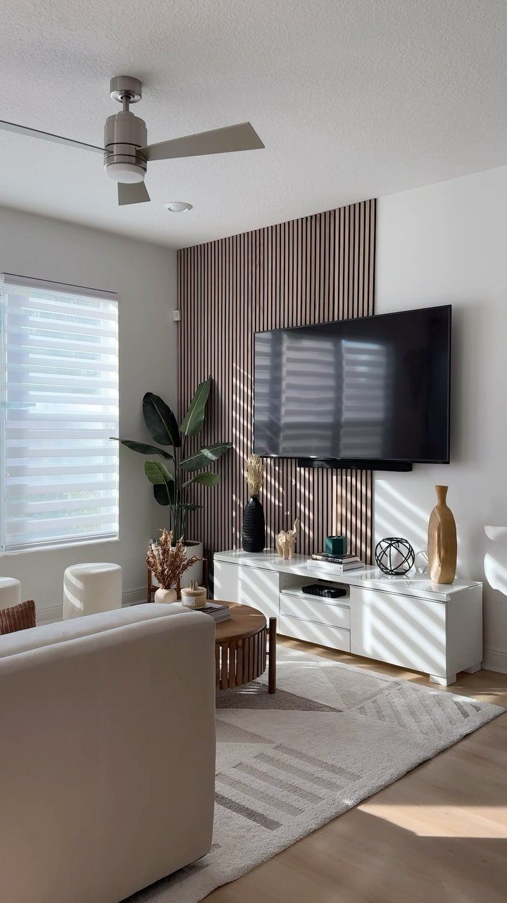
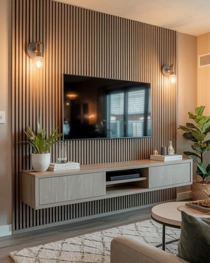
Vertical slats add rhythm without pattern, which makes them easier to live with than wallpaper over the years. Light wood with even spacing reads modern; tighter spacing or a darker stain shifts toward mid-century or even Japanese aesthetic.
The gap behind the slats is useful: run cables there, or mount the LED strip so the light filters through.
Check the slat direction against your ceiling joists if you are mounting heavy; horizontal blocking solves most problems, but it is easier to plan before the first slat goes up.
7. Marble Panel Accent Wall
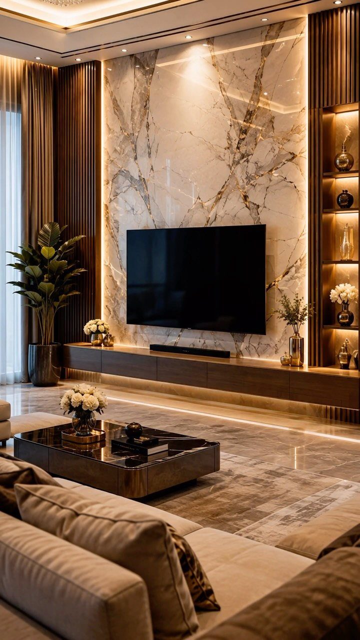
A marble panel behind the TV turns the screen into something that reads as intentional art rather than a black rectangle hung on drywall. The veining does the decorating; the TV almost disappears against it.
Real marble runs high per square foot installed, which gets painful fast for a full wall. Gold veining reads warm-toned; cool grey veining reads more modern, warmer cream bases feel traditional.
Polished surfaces throw glare back at the screen. A honed or matte finish fixes that, and I would not skip it.
Backlighting the panel from behind helps the marble glow without adding reflection.
This one suits renters only if they are willing to treat it as a statement they will uninstall later; the weight and the adhesive make it a commitment.
For a permanent home, though, it is the most finished-looking option on this list.
Choosing the Right Color
Eggshell or flat paint behind a screen scatters light instead of beaming it back; semi-gloss turns even a dark color into a mirror once evening hits.
I would test a patch at the actual wall height and watch it across a full day of sun and lamp light before committing to the gallon.
Ceiling and adjacent walls in soft white or cream keep the space from feeling like a cave; the TV wall becomes a deliberate accent rather than a closing-in.
For renters, a dark accent wall paints back to neutral in a Saturday afternoon, which makes it a lower-stakes experiment than built-ins or stone.
If the goal is a cave-like feel since you alredy have one dark wall, go dark. If the room is multi use, go lighter or let the ambient light guide you, .
Personal Style Considerations
Your existing furniture already points toward a direction, even if you have not named it.
A leather sofa with brass legs leans toward the warmth of terracotta or wood slats; a low gray sectional pairs more naturally with cool marble veining or slate paint.
I would hold a fabric swatch or a drawer pull from the room’s dominant piece against any sample before I decided.
The TV itself is part of this equation. Thin black frames disappear against dark paint; white or silver bezels fight it.
If your set has a visible logo or a thick chin, slats or shelves that partially mask the edges read better than color-matching that will never fully work.
A wall that looks settled when you walk in with groceries beats one that looks like a magazine spread.
Functional Vs. Aesthetic Balance
Hanging objects above the TV sounds balanced on paper and turns distracting in practice. The eye keeps sliding upward during dialogue; a framed print becomes a second screen nobody chose.
Keep the wall above the screen clean and put any art on the flanks, where it competes less with the picture.
Plan for cable management from the start, no matter which direction you go. Slats with a gap behind them swallow HDMI and power cords; built-ins need cutouts planned before the back panel goes in.
LED strips add one more plug. I would map every wire’s path on paper before buying a single board, because retrofitting always means a visible extension cord or a hole you did not want to cut.
The balance tilts differently for primary versus secondary viewing. A living room TV where people gather demands more finish; a bedroom set seen mostly with eyes half-closed can get away with simpler paint and no accents at all.
Frequently Asked Questions
Should the wall behind the TV be light or dark?
Darker is usually the better call. A pale wall throws light back at the screen and turns into a mirror once lamps come on; slate gray, deep blue, or terracotta absorb that bounce and let the TV seem to float.
How to camouflage the back of a TV?
Match the wall color to the TV frame itself. Black paint matched to a black bezel makes the frame disappear, and the TV starts reading like a pane of glass leaning on the wall instead of a bulky appliance.
The paint finish matters as much as the shade: matte against matte, never satin against matte, or the light catches differently and the edge shows.