Modern wainscoting can be built from paint-grade poplar and plywood all the way up to backlit systems that need a transformer and 12V strip on a dimmer.
The deciding factor is how much wall you actually own: renters need applied molding that lifts off with a putty knife, while permanent dwellers can build recessed panels with a gap behind the face for LED glow.
The 1×2 poplar slats spaced 1/2 inch apart are proof that the cheap end still demands math.
[link-whisper-related-posts]1. Minimalist Wainscoting
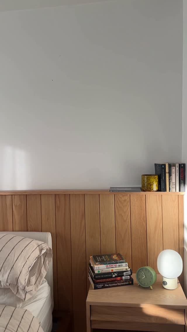
Shaker panels with a simple top ledge give you storage without visual weight. I would keep the wood tone light and skip the chair rail entirely; the clean break at the top edge does the quiet work.
This style suits renters who cannot commit to built-ins. The panels attach flat against the wall, and the ledge holds a clock, a lamp, a stack of books without calling for brackets or drilling into plaster.
Paint it two tones lighter than a dark wall if you want the room to feel taller without adding white trim everywhere.
2. Classic Beadboard Wainscoting
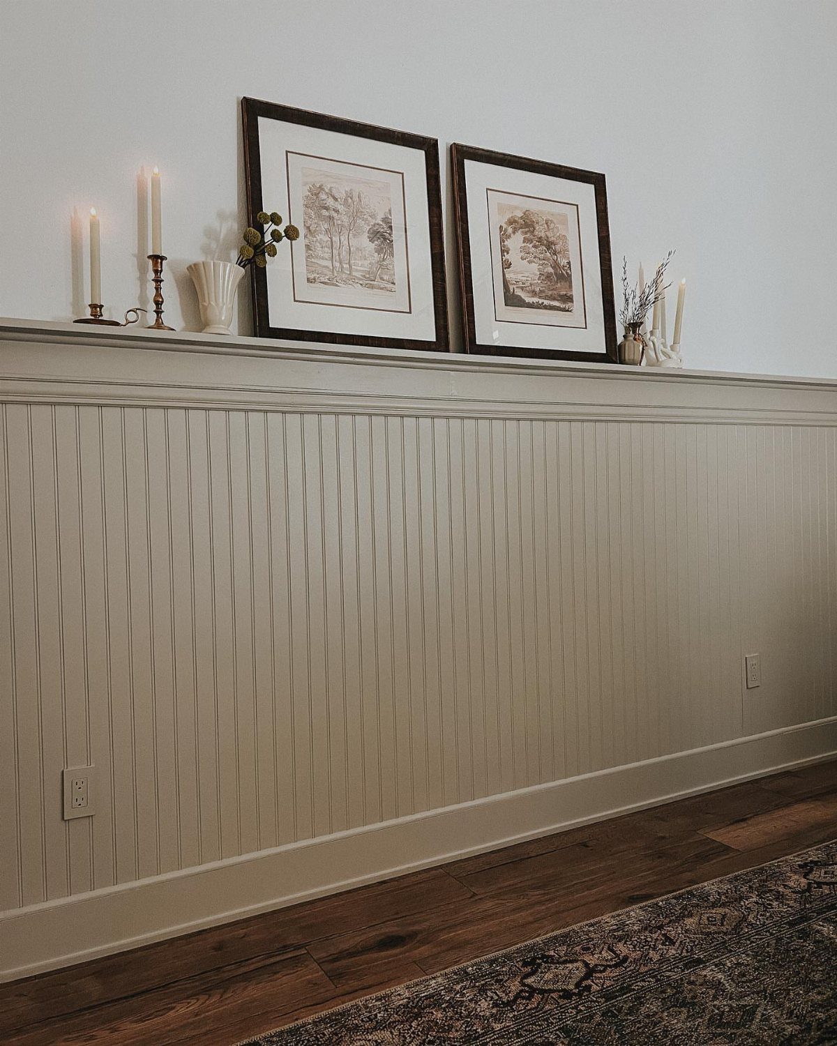
Vertical grooves read as texture from across the room and as detail up close, which is why beadboard works in narrow bathrooms where you stand near every wall.
The ledge at top is the practical half: a shelf for candles, small frames, a toothbrush cup if you are short on counter space.
I have seen this painted gray, cream, and white. White reflects the most light in a room with one small window.
Gray hides soap splatter and the scuff marks that collect at ankle height.
The grooves themselves cover patched plaster or uneven drywall without skim-coating the whole wall first. That saves a day of labor and the cost of a plasterer.
3. Board and Batten Wainscoting
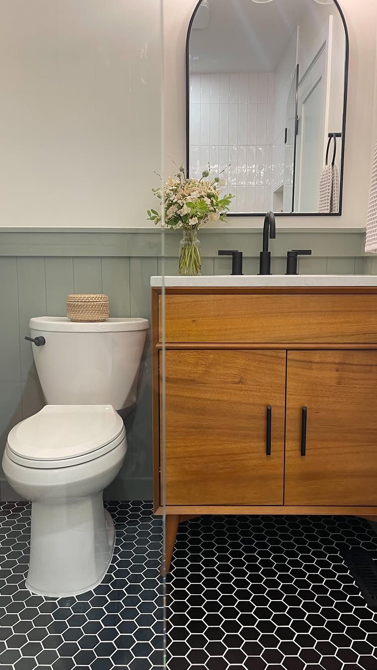
Wide boards with narrow strips covering the seams: that is the whole trick of board and batten, and it looks more complex than the work actually is.
The sage green reads as color without shouting; I would take that cue and pick a muted tone rather than a primary one.
Height matters more than color. In a room with a taller ceiling, take it higher and let the vanity feel built in.
The battens run over the boards, so you can use inexpensive plywood for the base layer and paint-grade poplar for the strips that show. No one sees the seam once it is covered.
4. Picture Frame Wainscoting
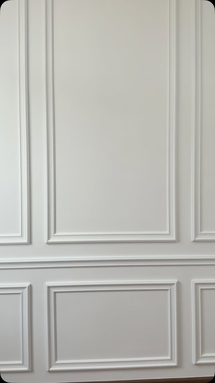
Rectangular molding boxes give a wall the structure of a gallery without hanging a single frame.
I would use this in a hallway that collects scuffs and fingerprints at waist height; the chair rail takes the hit instead of the paint.
The boxes work best at a consistent size, spaced evenly so the rhythm stays calm. Measure your wall length first and adjust the spacing rather than the box size so the pattern stays legible.
Leave the boxes empty for a quiet rhythm, or paint the inside a shade darker to fake depth without adding shadow. I have seen both; the empty version ages better.
5. Geometric Wainscoting
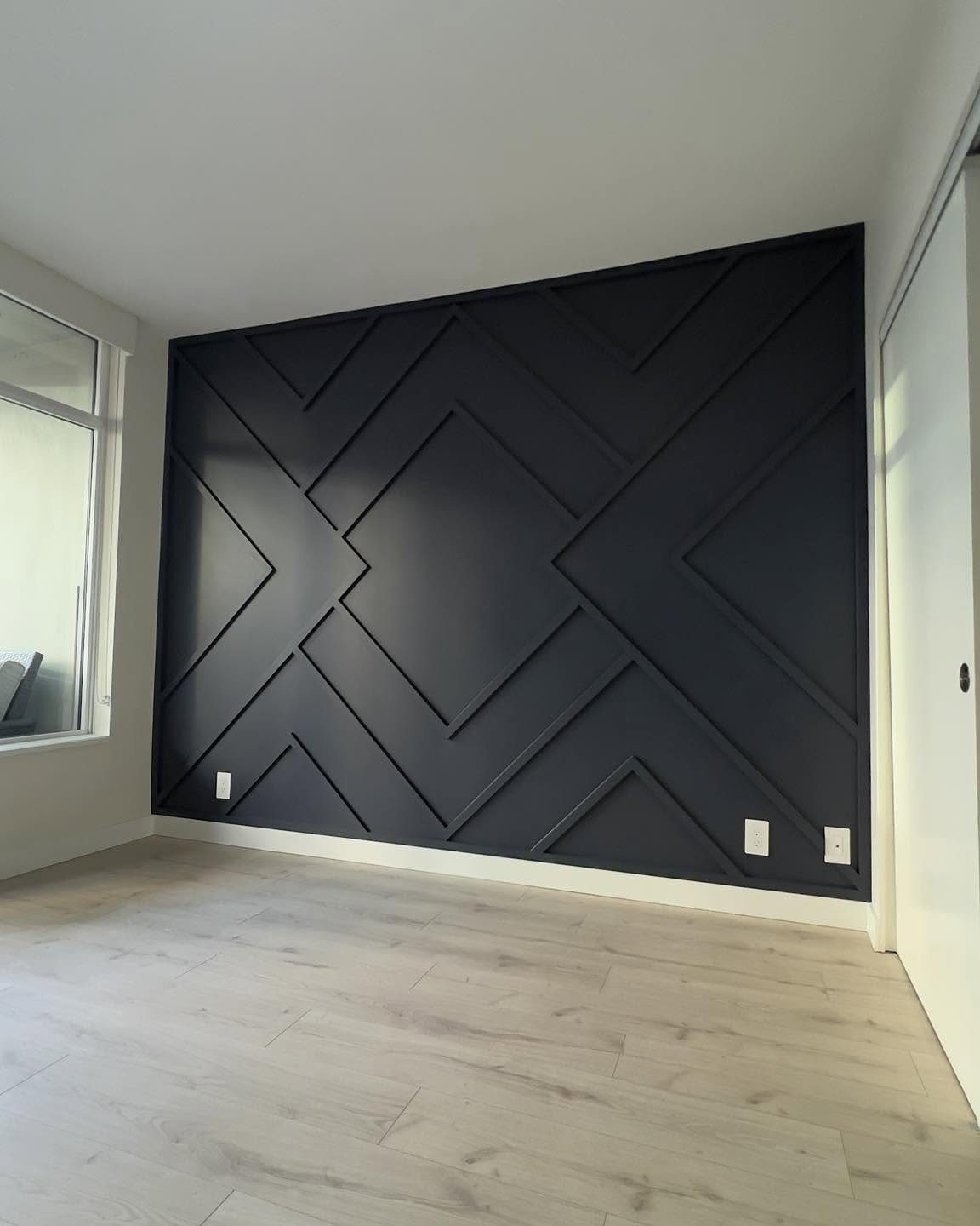
A single dark wall with raised slats in a repeating pattern turns into the room’s artwork without buying a painting. The diamonds here are cut from 1×2 stock, mitered at the joints, and nailed over a flat painted base.
The pattern needs a level floor and a square room to read correctly; an inch out of true at the baseboard multiplies by the time you reach the ceiling.
I would snap chalk lines before cutting anything, and dry-fit the largest diamond first.
Light wood floors and white adjacent walls let one dark wall carry the whole statement. Two patterned walls in the same room fight each other.
6. Mirror Wainscoting
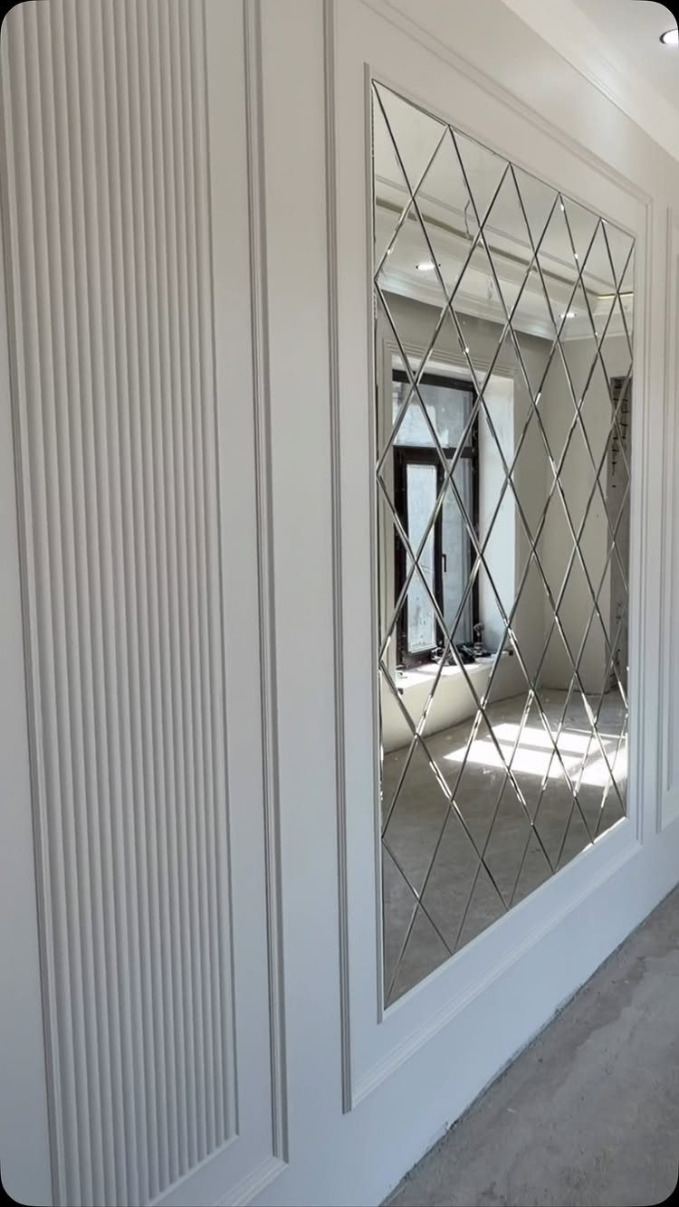
Beveled mirrors set into a paneled wall catch window light and bounce it toward the center of a room that would otherwise read as a corridor.
I would place this where the mirror reflects something worth seeing twice: a window, a chandelier, a piece of furniture opposite. A mirror facing a blank wall or a closet door wastes the effect.
The paneling around the mirror needs to be deep enough to receive the glass without proud edges. Build the frame thick enough to accept the mirror, and seal the back so moisture does not lift the silvering over time.
7. Vertical Wood Slat Wainscoting
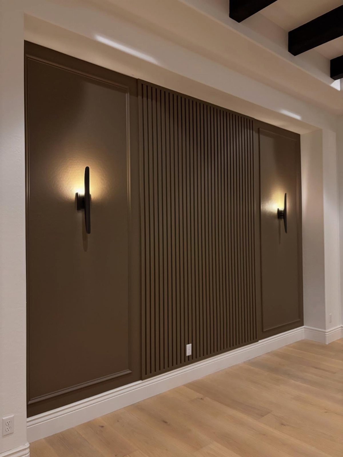
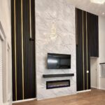
Sconces need flat wall on each side of the slats for the mounting box and trim, so leave enough panel space on both flanks.
I would build the slats from 1×2 poplar, spaced 1/2 inch apart, over a plywood backing so the wall stays flat. Paint the slats and backing the same color or the gaps read as stripes.
This eats more labor than board and batten because of the spacing math, but the material cost stays low for a short run of wall. Skip it if your baseboards are ornate; simple squared trim suits the clean lines better.
8. Moody Dark Green Wainscoting
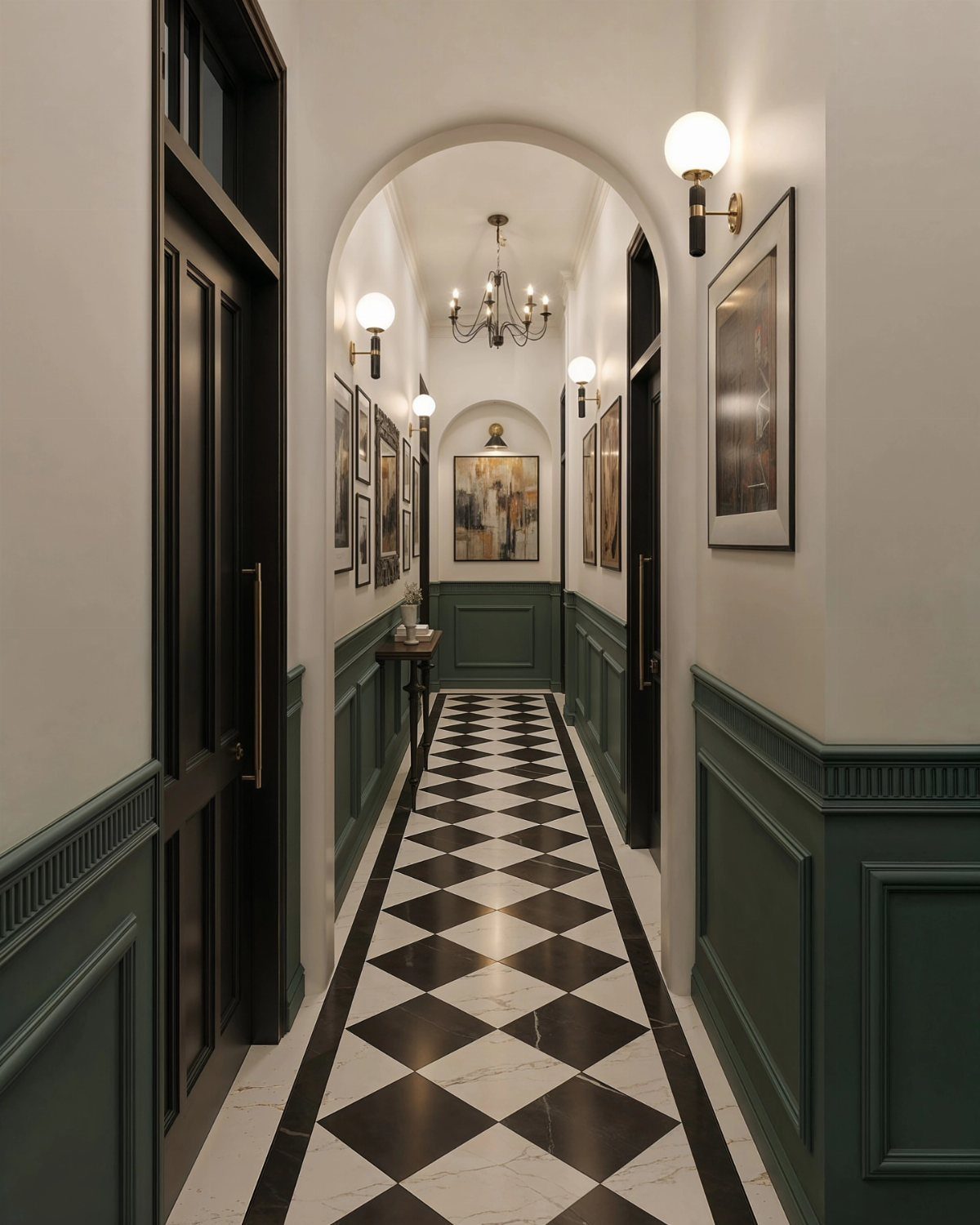
Dark green below the chair rail and white above it borrows from old libraries but feels current because the green is so saturated it almost reads as black in low light.
A checkered floor pushes it formal; with wood or concrete below, the same panels turn casual.
The risk is the room size. I have seen it work in a small room, but only with a strong light source: the sconces here, or a window directly opposite.
Matte paint hides the panel seams better than satin. I would use a scrubbable matte like Benjamin Moore Scuff-X in a color pulled from something you already own, not a swatch chosen in the store.
9. Wavy Curved Wainscoting
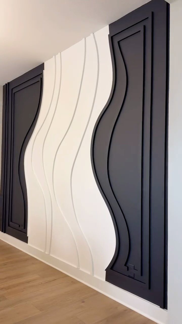
Curved molding and wavy vertical grooves move the eye slowly, which makes this a wall for a space you linger in, not a corridor you rush through.
The photo pairs navy outer panels with a white center; reversing that, white outside and color inside, would flatten the depth.
The curves are cut on a router or bought as flexible trim, and the labor jumps sharply between those two choices.
Flexible MDF trim costs more than straight stock, but fitting straight pieces to a curve means scribing each end, a full day of work for a single panel.
I would use this on one wall only, as the photo does, and keep furniture simple. A sofa or console with its own curves fights the wall; straight lines let the molding be the gesture.
10. Arched Wall Molding
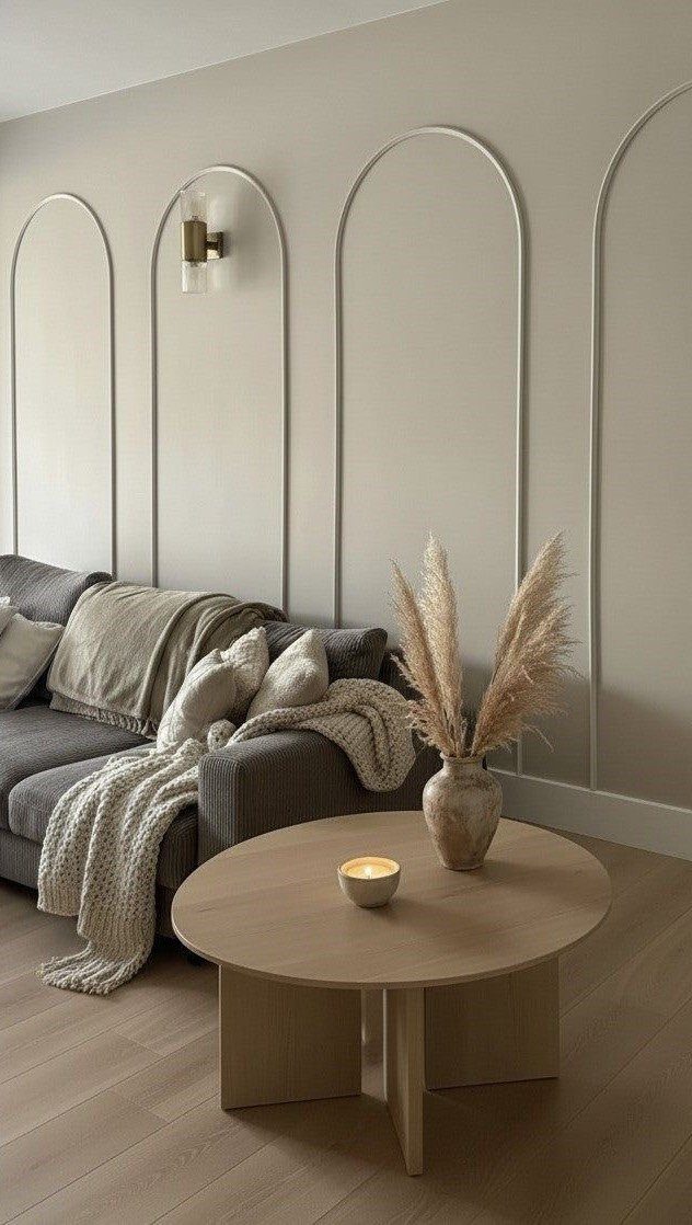
Applied arches sit on the wall surface instead of being built into it, so you get the look without losing floor space or recessing electrical boxes.
Large arches in a single color, beige on beige, read as shadow and architecture rather than decoration.
I would lay out the arches with a string and a pencil before cutting any molding; the curve has to be true or the eye catches it instantly.
Paint-grade poplar or MDF works, and the material runs cheap for a wall this size if you rip the flat stock yourself.
This suits renters or anyone who might move: the arches come off with a putty knife and the wall patches with joint compound.
Applied molding collects dust on its ledges, so a flat wall behind a sofa is smarter than one behind a desk you lean against.
11. Backlit Inset Panels
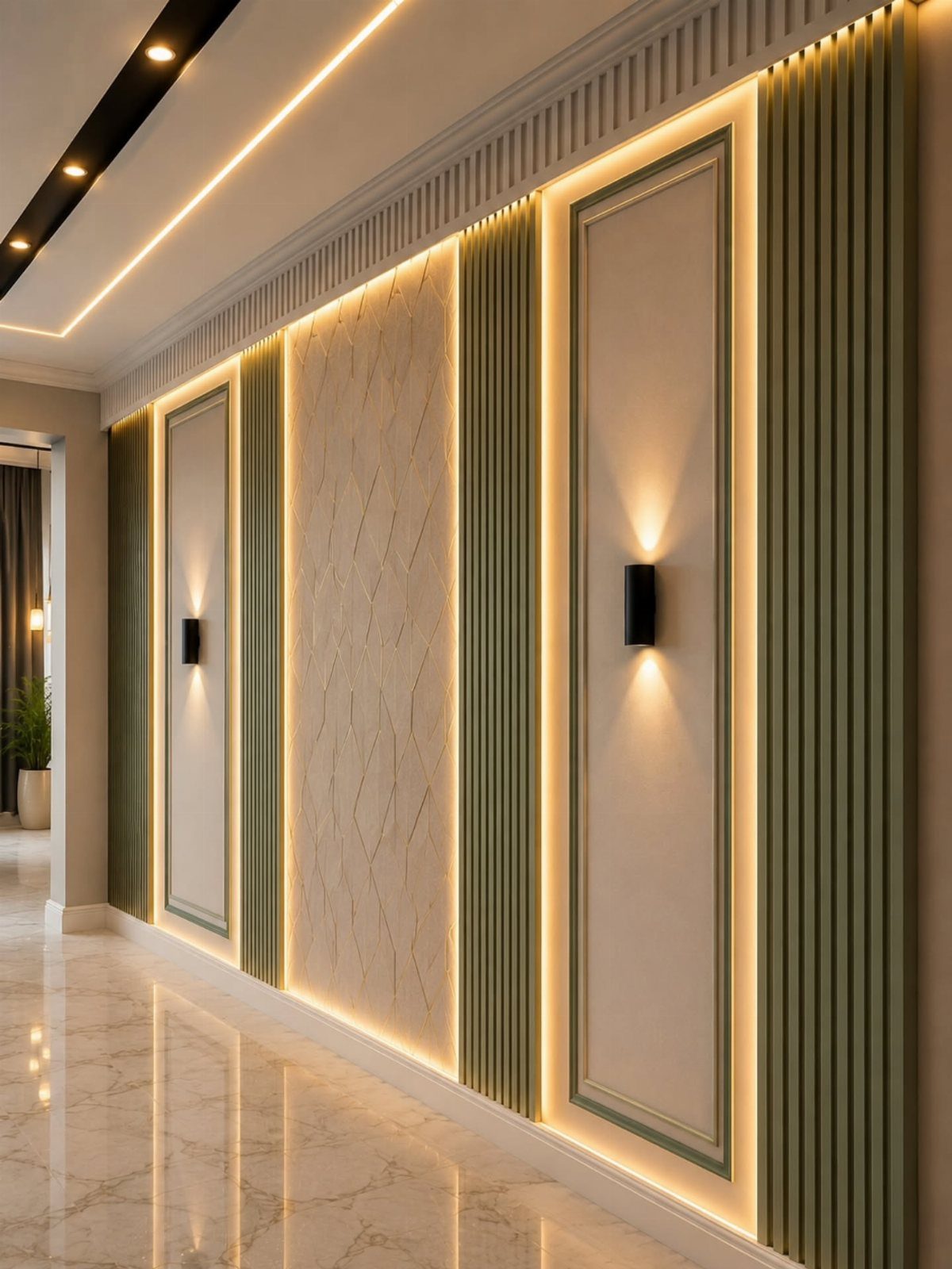
Warm LED behind recessed panels turns wainscoting into a light fixture, which means you are wiring as much as you are woodworking.
The glow comes from the top and bottom of each recess; that needs a gap behind the panel face, not a tight fit.
I would use 12V strip on a dimmer, not 120V rope, and plan the transformer location before closing any wall.
The fluted green section is a separate texture choice; you could do flat panels, reeded, or slats and the lighting still works.
This is the most expensive idea here by a margin: strip, channel, driver, and dimmer add up fast, plus the paneling itself.
It suits a hallway that needs its own light source or a dining wall where candles are not enough. Skip the backlit version and keep the recessed panels if your budget is tight; the shadow line alone adds depth.
Wainscoting Color Combinations
White wainscoting still reads as classic because it brightens a room and accepts any wall color above it.
I would pair it with black walls for the strongest contrast, or with white walls when the furniture and art need to be the event.
Painted panels open more territory. The lighter the wainscoting, the taller the wall feels; the darker, the more the lower half recedes.
Textured wallpaper inside panel frames gives you pattern without the labor of applied molding. I would use this where the wall color is flat and the room needs one more layer of interest.
Match the wallpaper tone to the trim so the texture, not the color contrast, does the work.
Wainscoting Height Considerations
The old rule still holds: set the cap rail at one-third of the total wall height. In most standard rooms I aim for wainscoting that clears most chair backs and leaves paint or paper to breathe above.
I would break the rule only when the ceiling is unusually low or high.
Full wall wainscoting, floor to ceiling, works where you want the wall itself to be the architecture; it reads as paneling rather than wainscoting proper, and it suits entryways or bedrooms where you need a single strong gesture.
Measure from the finished floor, not the subfloor, or the baseboard will throw the proportion off enough to notice. In rooms with sloped ceilings, follow the lowest point or the line will look drunk.
Wainscoting Materials
Solid wood takes paint well and repairs with filler, but it moves with humidity and costs more than the alternatives. I would use poplar for paint-grade work and a clear hardwood only where the grain shows.
Vinyl wainscoting suits bathrooms and laundry rooms where water splashes. It wipes clean, will not rot, and mimics beadboard or raised panels closely enough for a secondary space.
I would not use it in a main living area; the surface reads as printed, not dimensional, up close.
Metal wainscoting exists but reads industrial. It works in a kitchen or workshop where the rest of the room supports the note.
Plywood backing behind slats or battens saves money on the layer no one sees. Paint the front face before assembly so the seams stay sealed even if the wood shifts.
Wainscoting Installation Tips
Map the wall before ordering material. Electrical outlets, HVAC grilles, and window casings all interrupt a pattern, and moving a box is cheaper before the lumber arrives than after.
I would dry-fit the longest run first, especially with geometric or arched designs where error compounds. Snap chalk lines for every course; a level is not long enough to catch a bow in the wall.
Textured wallpaper inside panels skips the molding entirely and suits a weekend timeline. Cut the wallpaper slightly oversized, press it flat, then trim to the frame with a fresh blade.
Applied molding, including arches, sits on the surface and comes off with a putty knife. That makes it the right choice for renters or anyone who treats their finish as temporary.
Patch with joint compound after removal; the wall will need sanding and paint, but no structural repair.
Frequently Asked Questions
Can wainscoting look modern?
Yes. Flat panels with simple moldings and clean lines read as contemporary rather than traditional, especially painted in solid colors like black or white.
White panels in particular let you change wall colors or add wallpaper without the room feeling busy.
Should wainscoting be lighter or darker than walls?
Lighter wainscoting brightens a room and works with bold wall colors or wallpaper. Dark green or near-black panels below a white wall borrow from old libraries but feel current; the contrast adds depth.
White on white keeps things minimal and lets other décor stand out.
Does wainscoting make a room look bigger or smaller?
Height matters more than the molding itself. Lower panels make a ceiling feel higher in an average room; tall panels suit rooms that already have the height.
Mirror panels bounce light and visually expand a small space or narrow entryway.