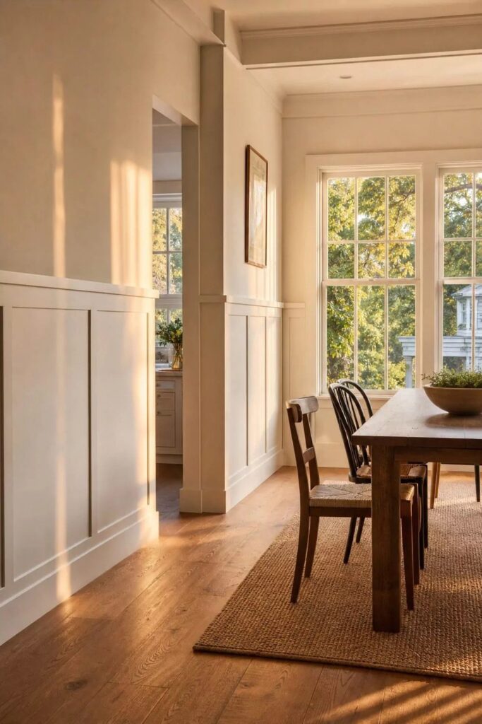
Painted wainscoting can run from a weekend of nailing trim over drywall to a full chair-rail install with laser levels and borrowed patience.
What decides which idea is yours is how much contrast your room can handle before it starts shouting instead of settling, whether you want classic white board-and-batten or something darker like navy or teal.
The ideas below run from 36 inches of wainscoting for 8-foot ceilings up to 42 inches for 9 feet, with Benjamin Moore shades from Chantilly Lace to Hale Navy named by where they land on that scale.
[link-whisper-related-posts]1. Classic White Board-and-Batten Wainscoting
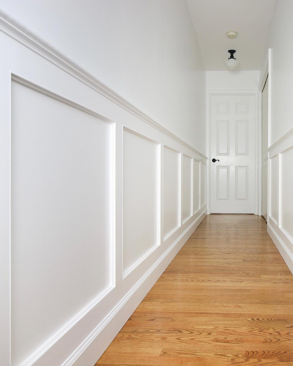
Soft white board-and-batten reads as architecture, not decoration, which is why it survives in a hallway you pass through every day.
I like Chantilly Lace OC-65 for this; it stays bright without the blue cast that makes some whites feel like a hospital. The vertical battens draw the eye forward, so the narrow space gains length instead of closing in.
Paint the door the same white and the molding disappears into one clean plane.
If your trim is already a warmer white, match it rather than chasing the perfect chip. Continuity matters more than any single detail.
2. Dining Room Wainscotting
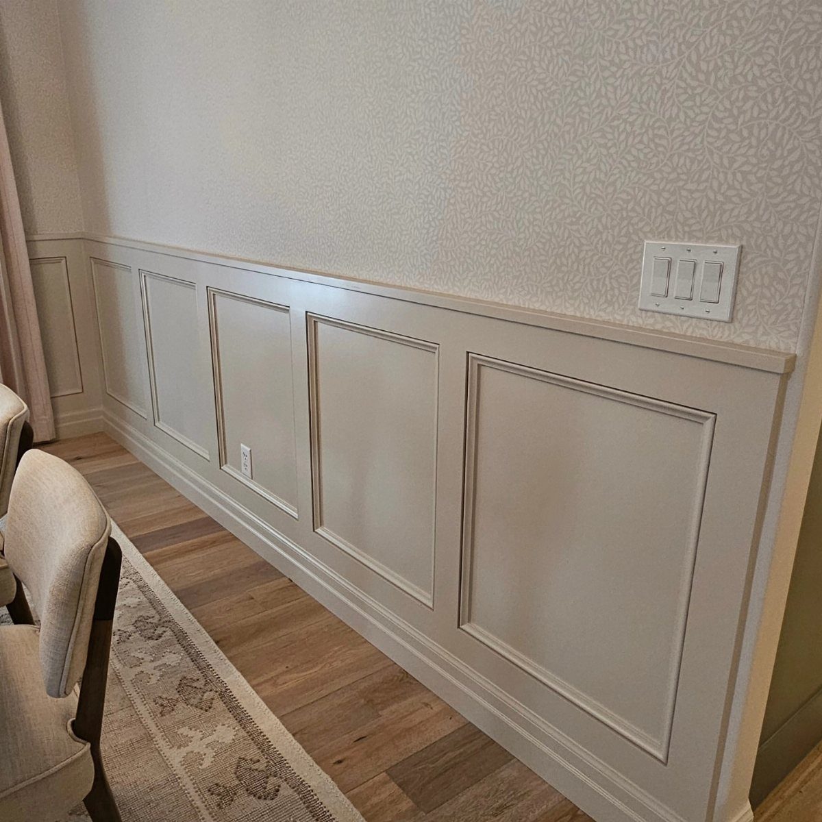
Beige picture-frame wainscoting under patterned wallpaper turns a dining room into a room that hosts dinner, not just a table that happens to have chairs.
I would try Black Ink 2127-20 below with Chantilly Lace OC-65 above if you want real contrast, or Mineral Alloy 1622 with White Drifts OC-138 for something quieter that still has layers.
This asks for a chair rail installed level, which means a laser level and patience, not a free Saturday. A wall that looks finished even before you hang art is what you are after.
3. Classic Neutral Wainscotting
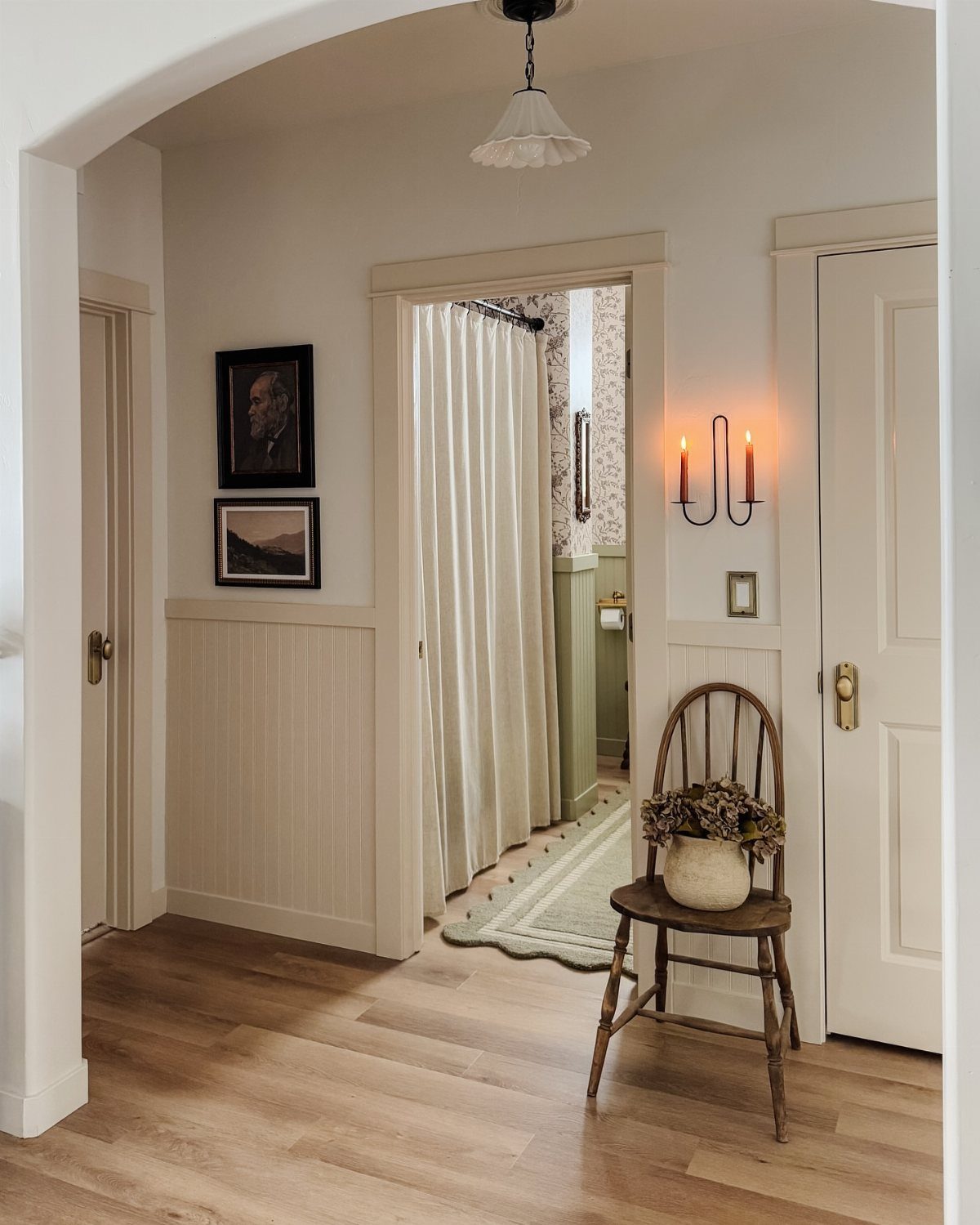
Cream beadboard wainscoting in a hallway with oak floors borrows from houses built before air conditioning, when rooms were designed to feel cool and still.
Portland Stone is the shade I would look at; it has enough yellow to warm the space without turning peach under incandescent bulbs.
The beadboard catches shadow at each groove, so the wall reads as texture even in a corridor with no furniture to soften it.
This suits renters who can install wainscoting panels over existing drywall and take them with the security deposit intact. Paint the chair rail and baseboard the same cream, or the eye stops at every transition.
4. Colorful Wainscoting with Neutral Walls
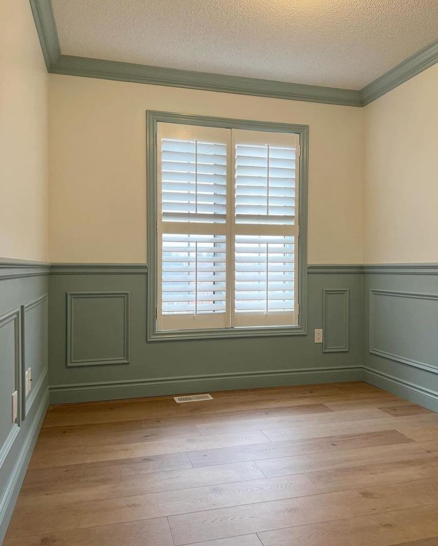
Sage green wainscoting against cream upper walls gives you color where your hands and furniture touch it, and calm where your eyes rest.
The plantation shutters repeat the cream, which is how you keep one color from shouting; the green is the statement, everything else agrees.
This works in a room that gets morning light, where stronger colors would turn garish fast. In a north-facing space, I would go darker on the wainscoting, not lighter.
5. Contrasting Painted Wainscoting
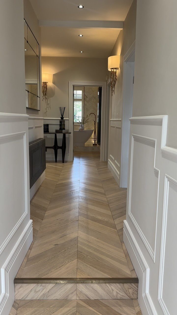
White wainscoting against beige upper walls with herringbone floors is a study in contrast without committing to a color you might tire of.
The two shades segment the wall so the white reads as molding and the beige reads as wall, not the other way around.
Acorn below Hopper is the combination I would try for a bolder version; the darker shade below makes the ceiling feel higher because your eye settles low.
Install the transition at 36 inches if your ceilings are 8 feet, 42 inches for 9 feet. Too high and the wainscoting fights the room; too low and it looks like a fence.
6. Bathroom Wallpaper Wainscoting

Sage green wainscoting with blue floral wallpaper above turns a small bathroom into a room you notice on the way to somewhere else.
The green grounds the pattern so the wallpaper does not float away, and the wainscoting takes the splash and scuff that would ruin paper at chair-rail height.
Poppy Trail wallpaper with Yellow-Pink wainscoting is the coordinated pair I would start from, though I would also look at tougher paint formulas for the lower half in a bathroom; steam and splash punish standard finishes.
This needs a bathroom with enough natural light that the green stays green. In a windowless powder room, I would go lighter on the wainscoting and bolder on the wallpaper pattern.
7. Painted Gray Wainscoting
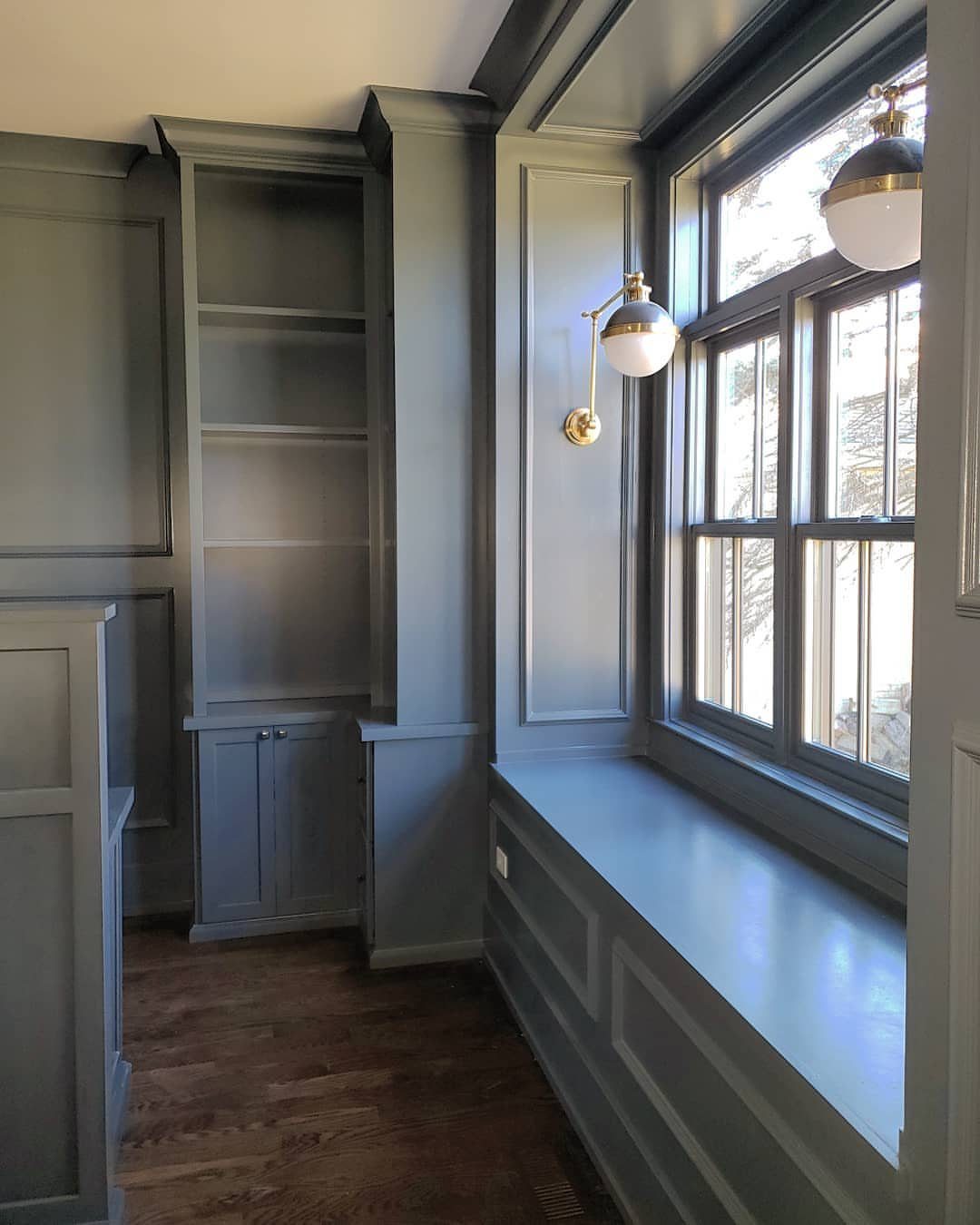
Gray wainscoting reads as wood paneling without the woodwork budget.
I painted mine in Benjamin Moore’s Gray Cashmere and the room felt taller the same afternoon, white walls above pulling the eye up while the gray below hid scuff marks from daily traffic.
For a built-in look like the photo, carry the same gray across baseboards, window trim, and any shelving. Mountain Air runs cooler; Bennington Gray carries more warmth if your floors lean red or yellow.
This suits households with kids or dogs better than white. Gray drinks light in a north-facing room, so add a brass sconce or two and test your swatch at dusk before you commit.
8. Sage Green Wainscoting
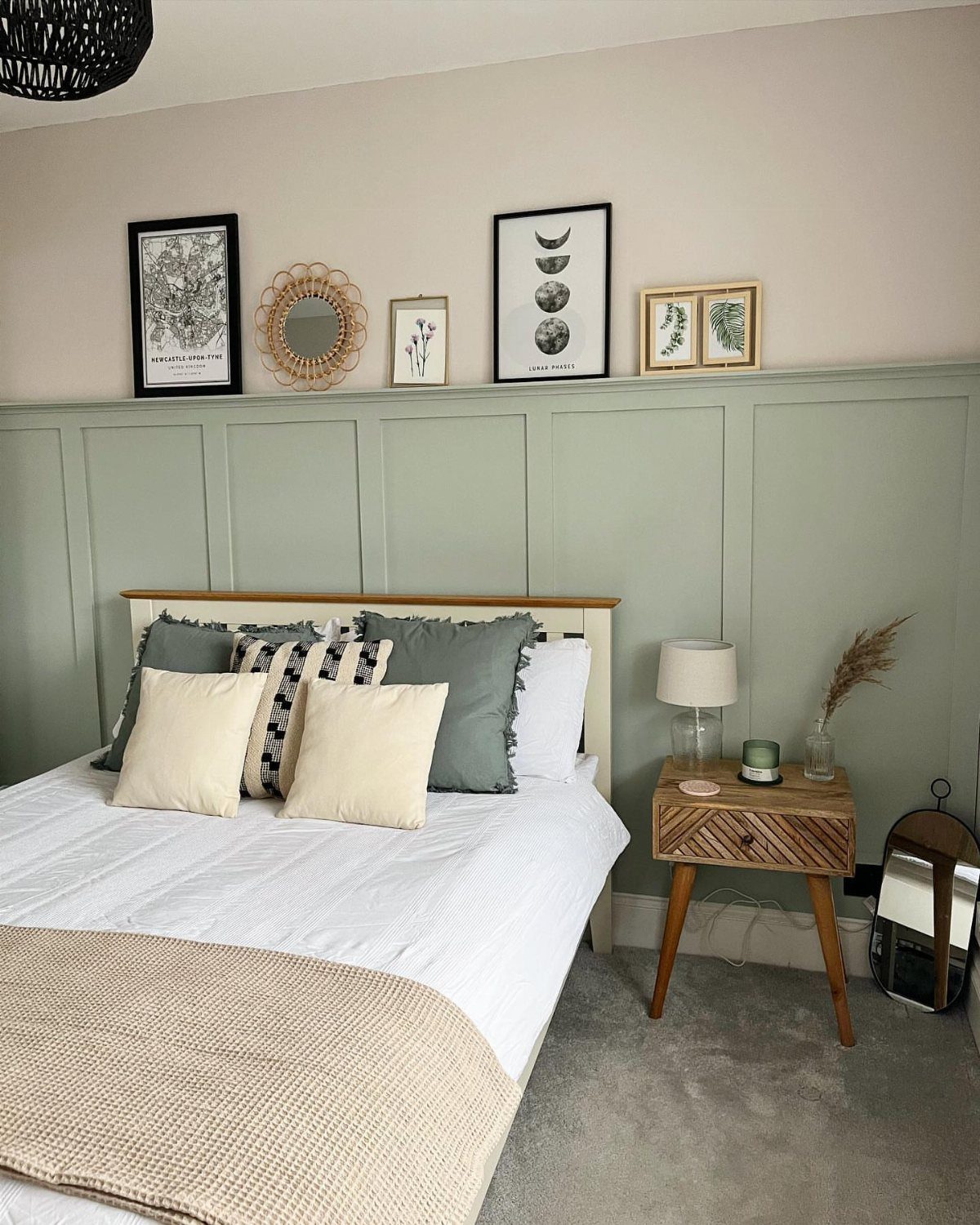
Sage green wainscoting works in bedrooms because it quiets down fast. A ledge rail along the top edge turns the wainscoting into a shelf for frames or small prints without extra holes in plaster.
Little Greene’s Sage Green in the lower half of a dining room gives soft contrast against Book Room Green above; in a bedroom, pair it with white walls and linen bedding to keep the mood light.
Benjamin Moore’s Salisbury Green leans more gray, Fiddlehead Green more saturated, so hold both against your floorboards before deciding.
I’d pick this for a rental with permission to paint, or a first home where you want color that does not shout. The catch: sage shifts with daylight, looking gray at noon and greener by lamp light.
Tape a sample to the wall and live with it through a full day and night before you commit.
9. Dark Teal Picture Frame Wainscoting
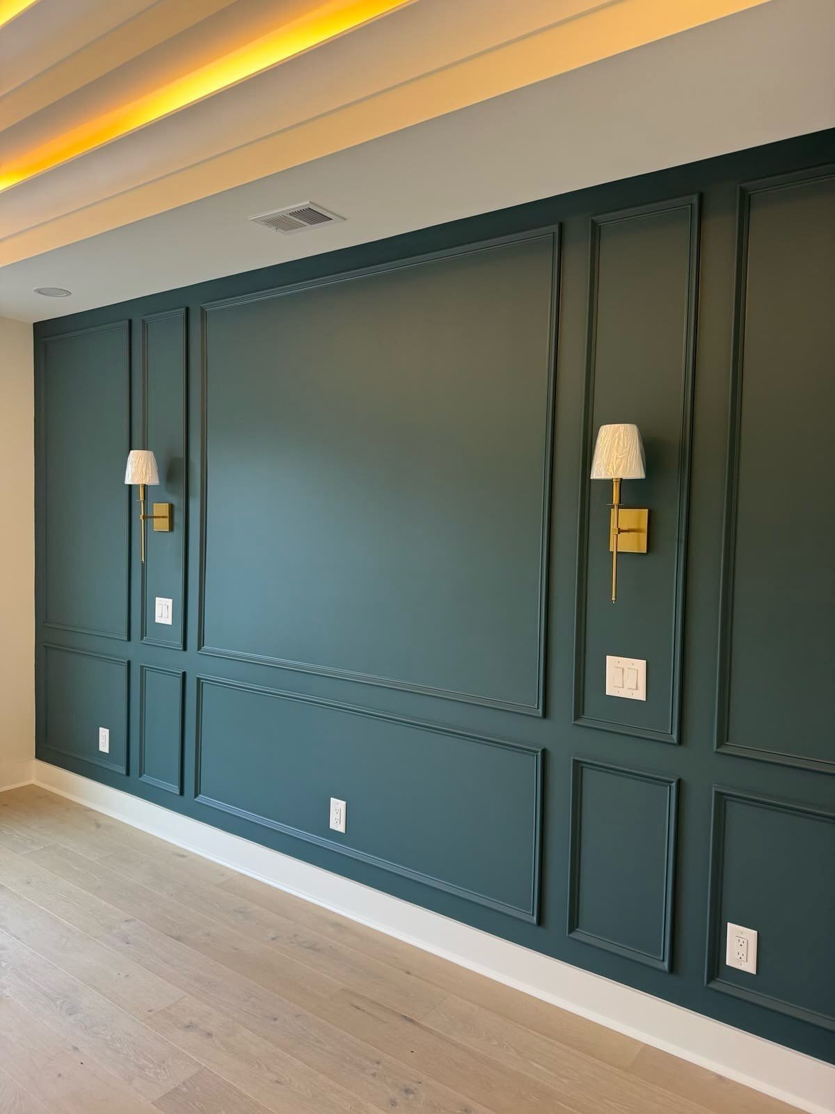
Dark teal wainscoting with picture-frame molding needs two things to work: enough wall height so the rectangles do not crowd, and warm metal somewhere nearby.
Gold sconces do the lifting here; without them, the teal can fall flat against pale floors.
Picture-frame molding is simpler than it looks. Each rectangle is trim mitered at the corners and nailed to the wall over a painted base the same teal.
Paint the boxes first, install the trim, then touch up. The molding casts slight shadows that read as depth under lamplight.
This color suits a room you pass through rather than one you sit in for hours.
Teal that deep closes in over time; I would use it in a hallway, a powder room, or behind a bed where you face away from it.
10. Navy Blue Paneled Wainscoting
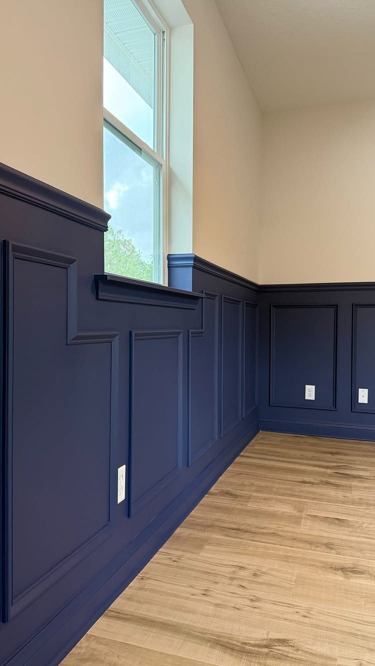
Navy wainscoting in a hallway solves the problem of a long, narrow space with no furniture to anchor it. Raised panels read as built-in architecture rather than applied trim, especially against beige above and light wood floors below.
Benjamin Moore’s Hale Navy is the usual starting point, but Evening Dove runs softer and Manor Blue carries more gray. Lazy Sunday works if your upper walls already have warmth.
Paint the panels and the rail the same navy; break the color only at the baseboard if you want the wall to feel taller.
Brush marks show, and cheap trim reads as costume. Spend on the molding, save on the paint if you must.
I would save navy this deep for a room that has some width to it; the color needs breathing room.
Choosing Wainscoting Colors
Paint is cheap and a weekend of work, not a structural change, so the risk is lower than it looks.
High contrast between upper and lower walls adds more energy than either color alone. Two colors that share the same undertone will contrast without looking like a mistake.
Wainscoting Styles
Board and batten, beadboard, and shiplap each carry a different mood. Vertical shiplap leans rustic and cottage; pair it with a warm neutral like Affogato if you want the room to feel pulled together rather than themed.
Beadboard reads older, more porch-like. Board and batten is the most architectural, the vertical lines adding height to a low ceiling.
Wainscoting traditionally covers one-third of the wall or more, which is enough to matter without overwhelming the room.
The style you choose matters less than how consistently you carry it through; mismatched trim profiles where two walls meet read as a mistake, not eclecticism.
Durability of Wainscoting
High-traffic spaces need wainscoting for the damage it absorbs, not just the look. A boot room or laundry room takes knocks that would ruin wallpaper or flat paint above chair-rail height.
The finish matters as much as the color: satin or semi-gloss, something you can wipe down without lifting the paint.
Waterborne alkyd paint sits on trim and wainscoting harder than standard latex. It costs more per gallon and needs longer to cure, but the surface survives daily contact.
In a bathroom or kitchen, that durability is non-negotiable; steam and splatter find every weak spot.
Wainscoting in Different Rooms
Any room can take wainscoting. The question is what job you want it to do.
In a living room, vertical lines add structure to a space that soft furnishings tend to blur. In a bathroom, the lower half protects the wall from water and the upper half stays free for pattern.
In a hallway, wainscoting gives the eye something to follow through an otherwise empty passage.
A room with no natural light needs that contrast more, since shadow already flattens everything into one plane.
Frequently Asked Questions
What is the best color to paint wainscoting?
White and off-white still dominate for a reason: they read as architecture, not decoration, and they survive daily traffic without demanding attention.
Chantilly Lace OC-65 stays white without sliding into that cold blue that makes a room feel like a clinic; Portland Stone warms up cream when you have oak floors or bulbs that already lean yellow.
Bold colors work too; sage green quiets a bedroom, navy anchors a hallway, and dark teal makes a statement in a powder room you pass through rather than sit in for hours.
What is the golden rule for wainscoting?
The traditional rule is one-third of the wall height, which translates to about 36 inches for 8-foot ceilings and 42 inches for 9-foot ceilings.
The rule I follow is one-third up the wall for standard ceilings, half for anything over 9 feet; eyeballing it usually lands you in one of the two bad zones.
A laser level turns a two-day job into a four-hour job, and the four-hour version is the one that looks right.
Are you supposed to paint wainscoting?
Yes, and paint is what turns wainscoting from applied trim into built-in architecture. Matching paint across wainscoting, chair rail, and baseboard keeps the wall reading as one plane; two colors break it into upper and lower stories.
In bathrooms, I would look at tougher paint formulas than standard finishes; steam and splash punish ordinary paint.
How do you make wainscoting look modern?
Clean lines and bold color choices do the work. Board-and-batten in soft white loses the fussy details that date traditional wainscoting, and the vertical lines pull a narrow room forward by a few visual feet.
Benjamin Moore Gray Cashmere on flat boards gives you the gravity of paneling without the millwork bill, and running it onto baseboards and trim finishes the lie that it was always there.
Picture-frame molding in dark teal with gold sconces nearby bridges traditional craft and contemporary boldness.